Rebuild · Speed
Seetha The Comic: Figma to Pixel-Perfect Astro Rebuild, Mobile PageSpeed 50 → 99
- Client
- Seetha The Comic, corporate entertainer and stand-up comedian. Client project (Upwork), Phase 2.
- Design
- Designed by me in Figma
- From → To
- Previous site → Figma redesign built in Astro + Sanity CMS on Netlify
- Stack
- Astro, TypeScript, Sanity CMS, Netlify, GitHub
- Key result
- Mobile PageSpeed 50 → 99, desktop 88 → 100, SEO 69 → 100

01 / The brief
Phase 1 moved Seetha off Squarespace. For Phase 2 he wanted a full redesign. I designed the new site in Figma and then built it myself, so the finished site matches the design exactly.
The previous site was slow on phones and weak on SEO, which matters for a performer who gets booked through search and referrals.
02 / What I built
- Designed the whole site myself in Figma (desktop, tablet and mobile frames for every page), then built it, so the design and the code stay in step.
- Ten pages: home, about, corporate, podcast, clients, shows, contact, privacy, terms and a 404. Seven come straight from Figma frames; privacy, terms and 404 are ported from the old copy.
- Every page drawn at three widths (1440 desktop, 768 tablet, 390 mobile), and sizes slide smoothly between them, so nothing jumps at in-between screen sizes.
- Pixel-perfect: each section was measured in the browser against Figma's own sizes and positions, usually within 1 to 3 px at all three widths.
- Static HTML built ahead of time with almost no JavaScript. The menu uses the browser's popover, the FAQ uses native open/close sections, and the marquees are CSS only. Scripts are limited to the review carousel, photo viewer, forms and analytics.
- No layout shift: every image has fixed dimensions, fonts are local with matching fallbacks, and images are served as AVIF and WebP in several sizes.
- Google Analytics loads on first interaction (or after 6 seconds) so it doesn't slow the first load.
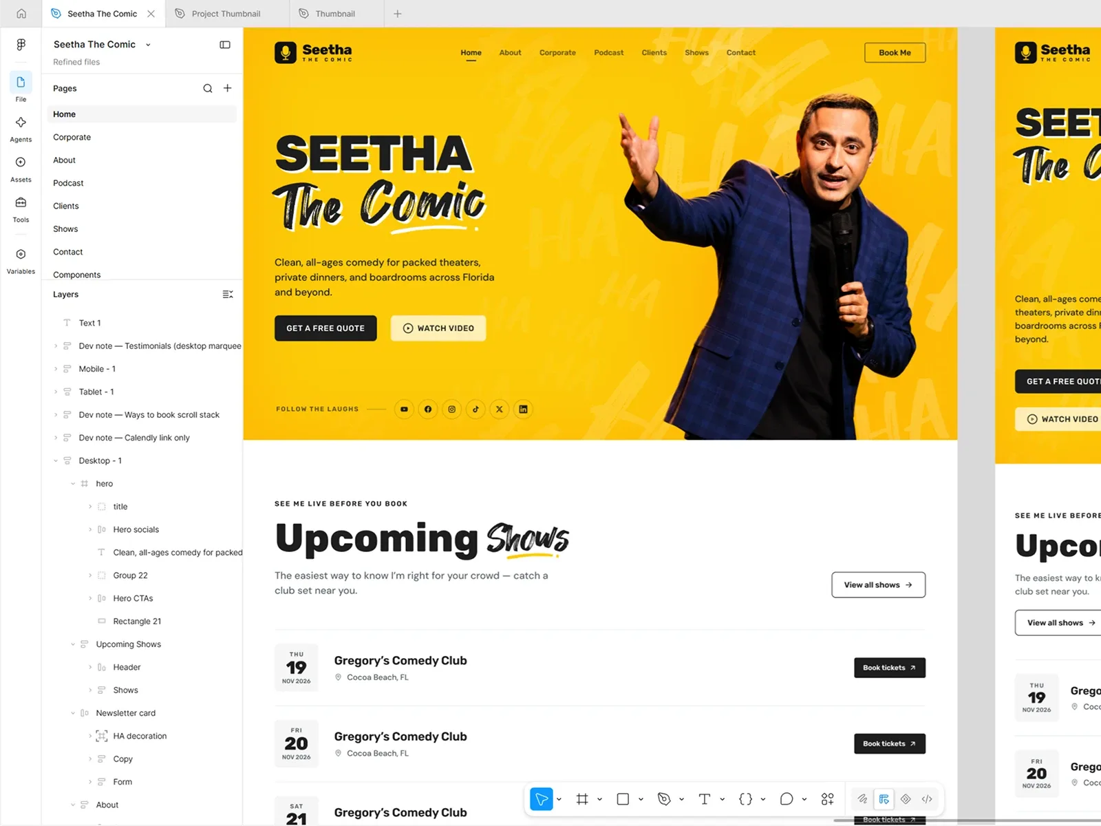
The Figma design I made before building.

03 / What stayed the same
Nothing broke in the move. The contact and newsletter forms send the same data as before, old addresses redirect permanently, the sitemap, canonical URLs and structured data are in place, and Google Analytics keeps the same measurement ID.
04 / Content he manages himself
Shows, podcast episodes, reviews, FAQs, clients and logos, gallery and site settings are edited in a Sanity studio. A "Publish site" button in the studio rebuilds the live site, so he controls when changes go out. Page headings and layout copy stay in code because they are tied to the design.
05 / The result
| Before | After | |
|---|---|---|
| Mobile performance | 50 | 99 |
| Desktop performance | 88 | 100 |
| Accessibility | 91 | 100 |
| Best Practices | 96 | 100 |
| SEO | 69 | 100 |
| Mobile Largest Contentful Paint | 13.7 s | 1.8 s |
| Mobile First Contentful Paint | 9.3 s | 1.0 s |
| Mobile Total Blocking Time | 290 ms | 0 ms |
| Desktop Largest Contentful Paint | 1.5 s | 0.4 s |
Chrome Lighthouse, same page before and after.
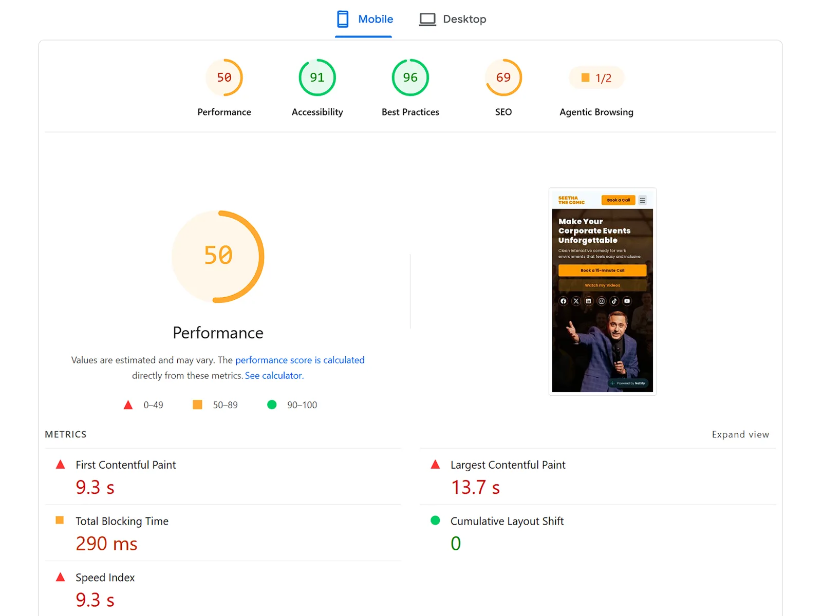
Mobile, before
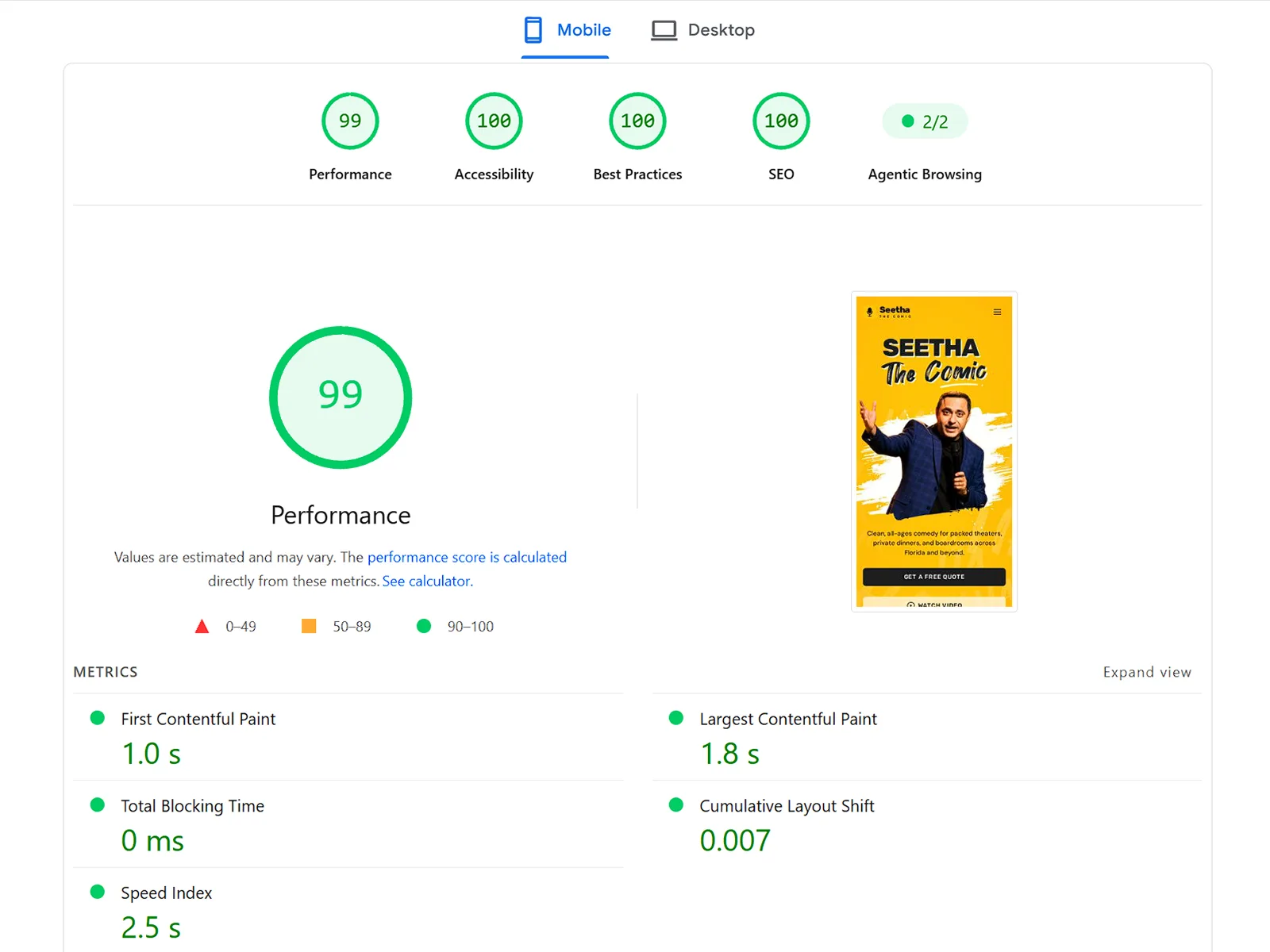
Mobile, after
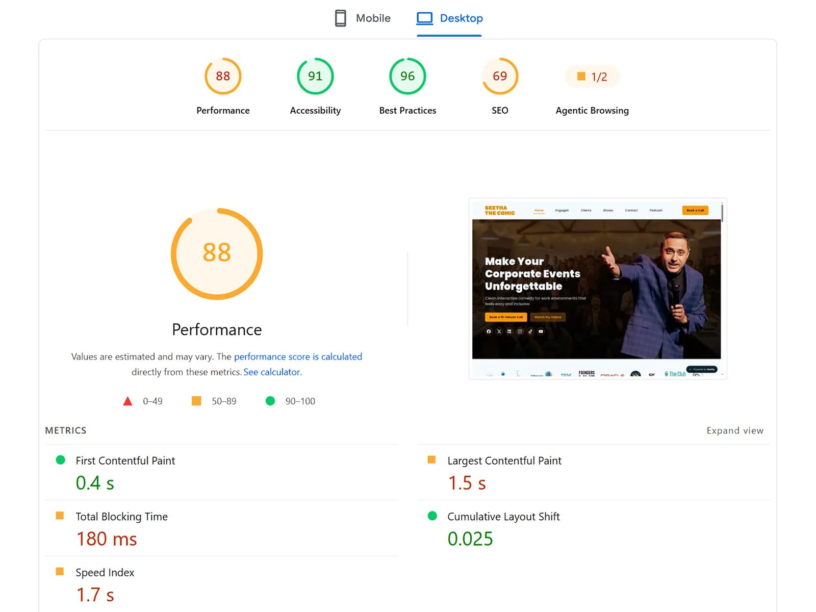
Desktop, before
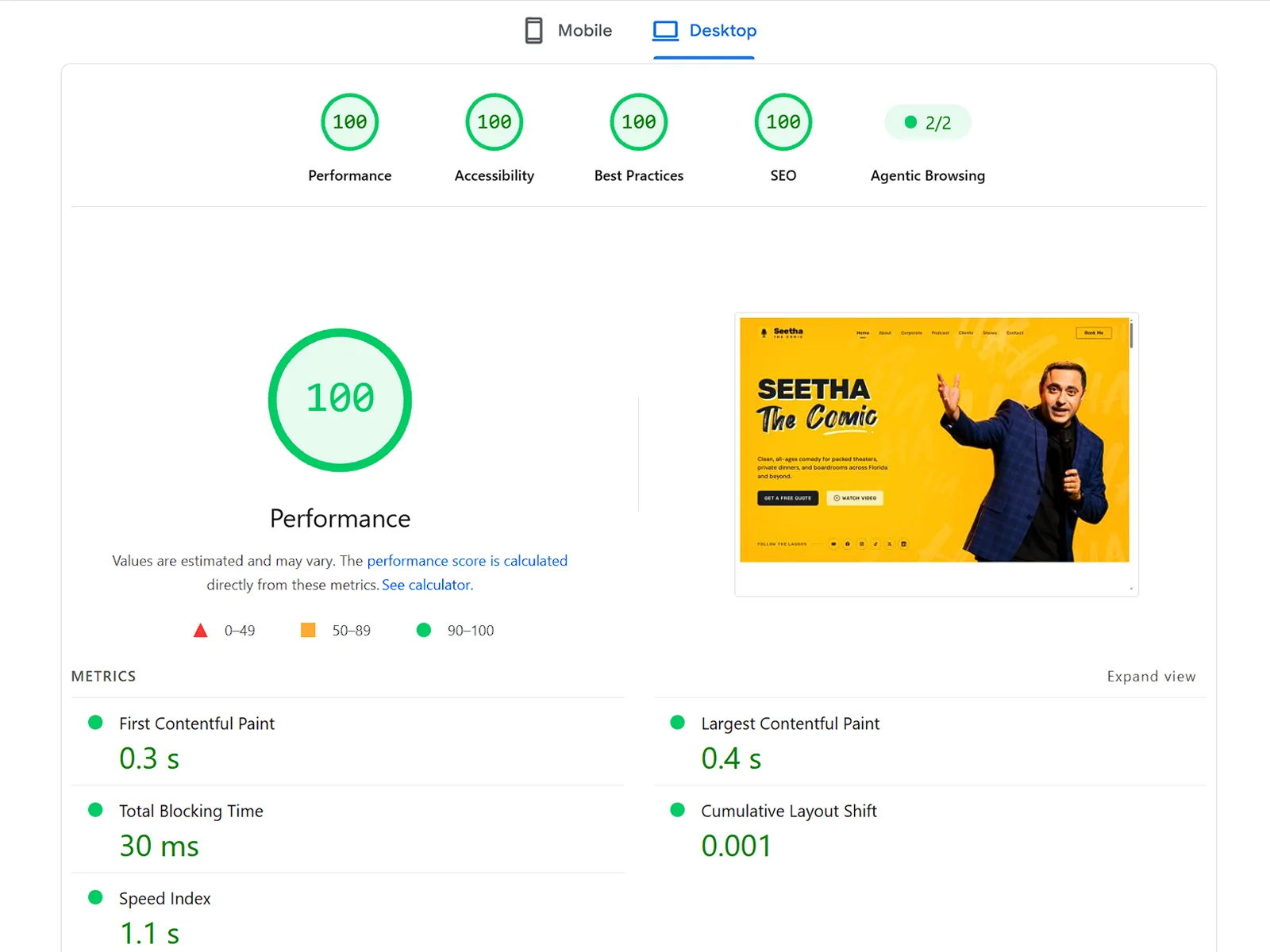
Desktop, after


What I'd do for you
Have a site that's slow on phones, or a Figma design that never quite matched the live site? Send me the link and I'll tell you what a rebuild would take.
Send me your site